


GRAPHIC DESIGN, LOGO DESIGN, NAMING
MUSIC Brand Identity
Instrumental
My friend Noah Fowler wanted to build a series of live music events to raise funds in support of emerging Cuban underground musicians. An idea that was an easy yes and it turned into one of the first projects I worked on upon my arrival in the U.S.
We brainstormed names and during the process “Instrumental” came up to me as a good contender. It a double meaning that connects the brand to “music” and to the purpose of being instrumental, helpful to support music being created in really challenging contexts. The name can also be read in Spanish with the same meaning, it can be embraced by cuban audiences and creatives too, and not as a foreign project but as an element that unites us.


Considering this brand would live in spaces like social media, merch, combined with a list of other logos by sponsors, bands, or event names, it was key to design both a symbol and a logotype. A symbol is a quick identifier and an iconic graphic piece. And a logotype can “sign” messages, posters, contracts and videos.
After much exploration we settled on a solution that represents the shape of a capital “i” that vibrates with sound and spreads music. A monogram that’s more vertical than horizontal or squared, a guarantee of differentiation, and great potential for 2D, 3D animation and video post-production.
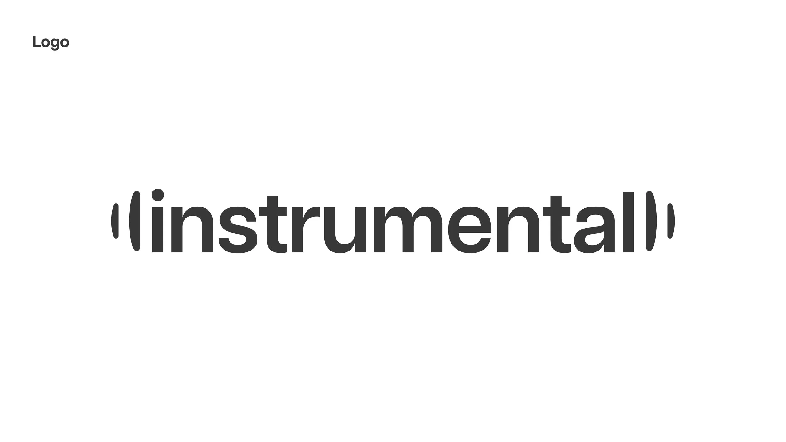
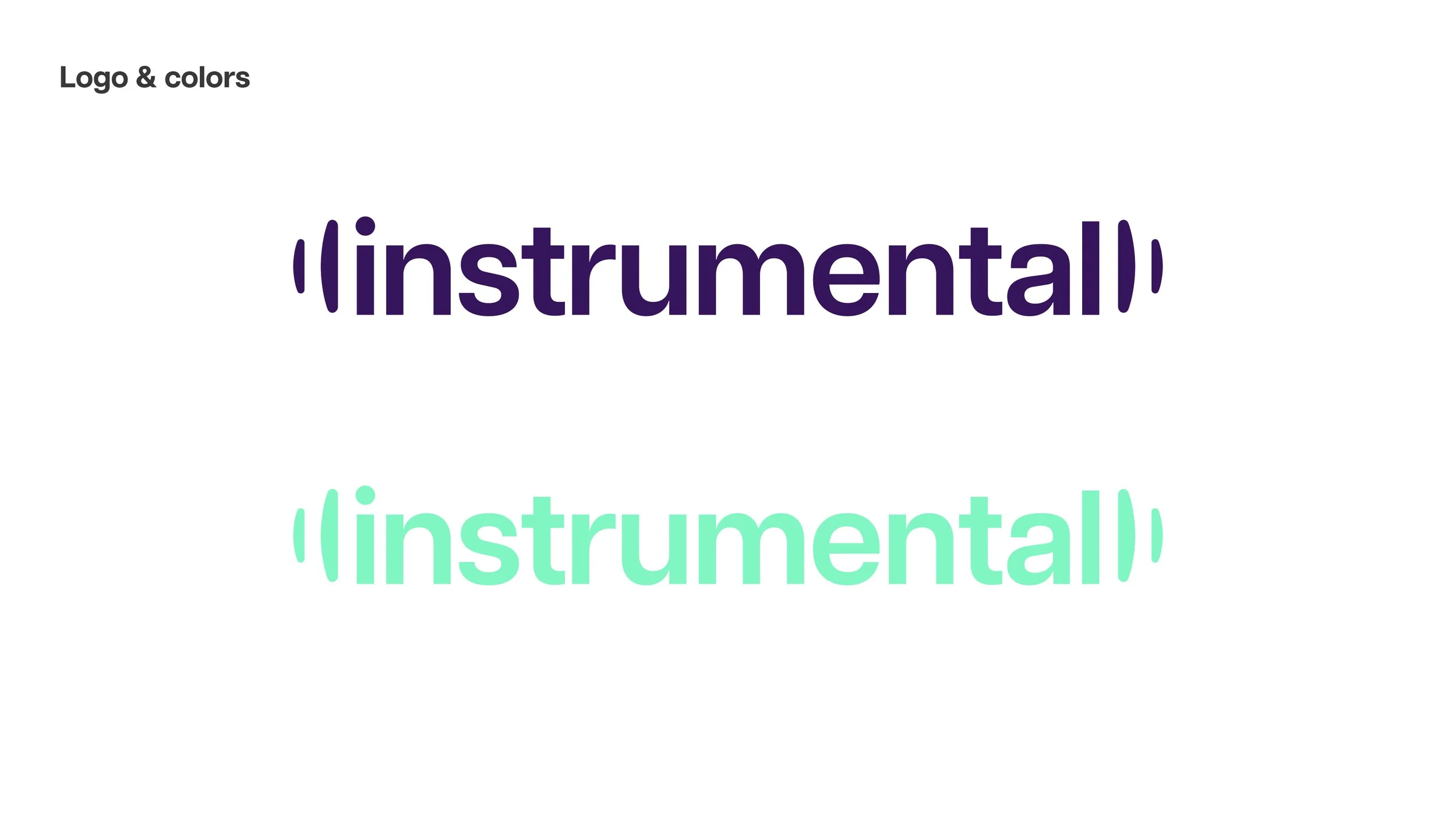
For the logotype, I wanted to use a typography that wouldn't compete with the monogram but could still have some character, especially in its lowercase form. It’s a “grotesk” style typeface similar to the famous “Helvetica”. A nice surprise was the similarity of the “i” and the “l” at both ends of the word. Adding the “vibrating” elements of the monogram to both sides of the logotype created a really distinct result, still visibly part of the visual identity but able to stand on its own feet and identify even without the monogram.
Full disclosure, I wanted to have a capital “I” at the beginning of the word, but I had to concede that it could cause some confusion for the reader because of the “vibrating” elements. :-)


logo sketch exploration
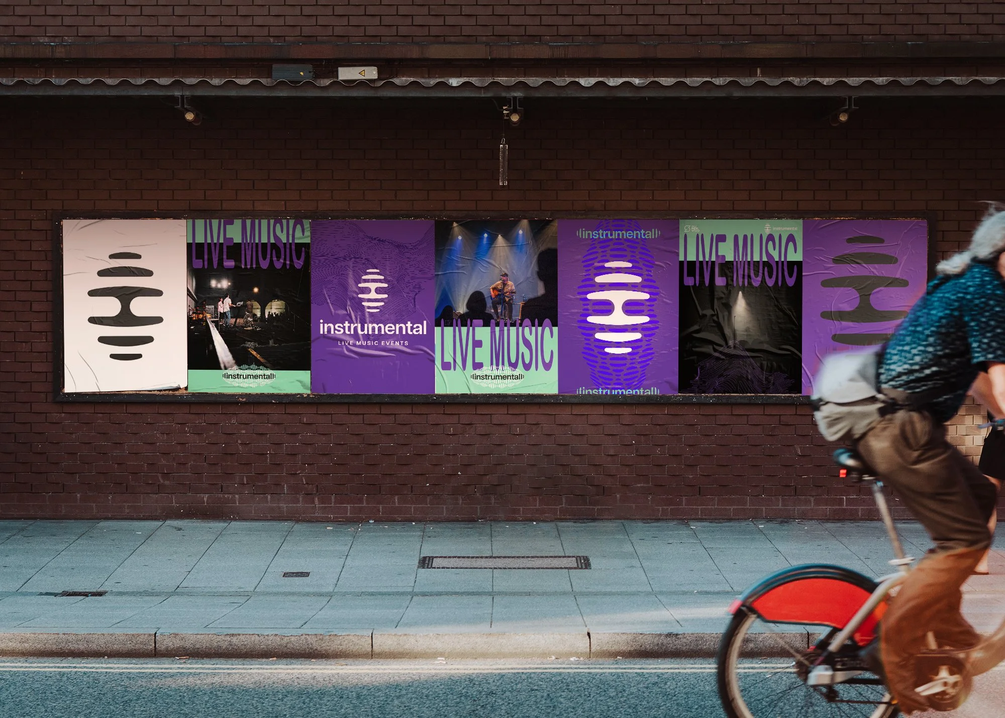
After the “nice surprise” with the logotype I went ahead and kept exploring more uses for the “vibrating” elements to create patterns and supporting graphics to use in marketing and communication.


some brand applications for the future of Instrumental in the live events industry. This brand is still a young project with a lot of potential to grow.


instrumental

GRAPHIC DESIGN, LOGO DESIGN, NAMING