ART DIRECTION - CREATIVE DIRECTION - BRANDING - GRAPHIC DESIGN
Branded sermon series Design
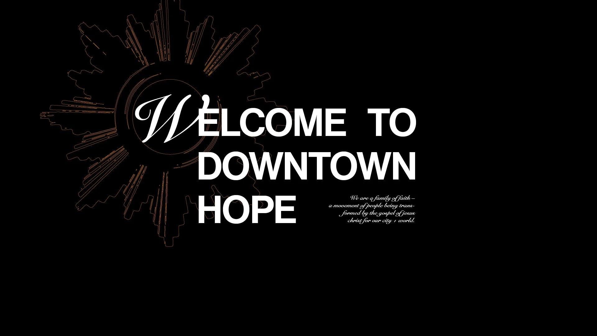
“Mirror” at Downtown Hope
A church sermon series embarks on a study of a specific book or topic in the Bible, normally lasting two or more Sundays. At Downtown Hope, I designed around a dozen branded sermon series, one sermon series at a time. Mirror is just one example.
Downtown Hope did a rather short, five-week sermon series on the epistle of James in the New Testament. It would happen right after Easter, and in a way, it was a “back to the basics” series. Simplicity and clarity were very important for a book that’s charged with deep, challenging wisdom and hot takes.
AUDIENCE: Church Attendees.

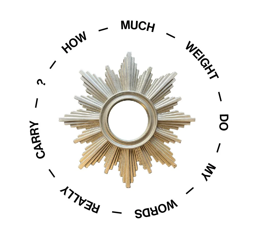
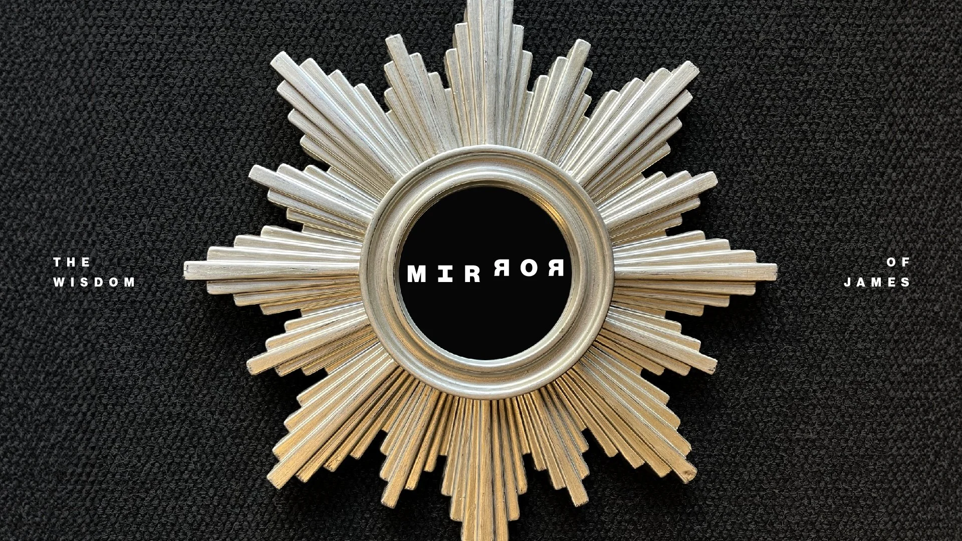
concept: the mirror
Mirror, a simple title and a simple definition to what the author of the epistle’s intention is. To put a mirror in front of our hearts, motivations and identity. That’s the conclusion I arrived at in collaboration with the church leadership for this series’ naming.
As a “back to basics” series I went back to using the font Neue Haas Grotesk, all caps, for a clear, high readability title. I added extra space between characters and played with a sort of serif to the “i” both to add a distinct element and also to solve a balance problem that the normal “i” would create being so narrow in shape compared to the other letters. With the two horizontal elements top and bottom the weight balance of the whole composition would balance.
The characters of the second half of the title/word are inverted to reinforce the concept of reflection. And for more emphasis, the two “R” are reflected in front of each other, like on a mirror. The vertical displacement of the second half of the title/word conveys the tension and attention this book requires.
It was a good typographic exercise on adding meaning and distinction while respecting simplicity and ease of comprehension.
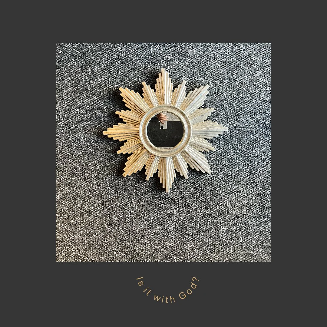
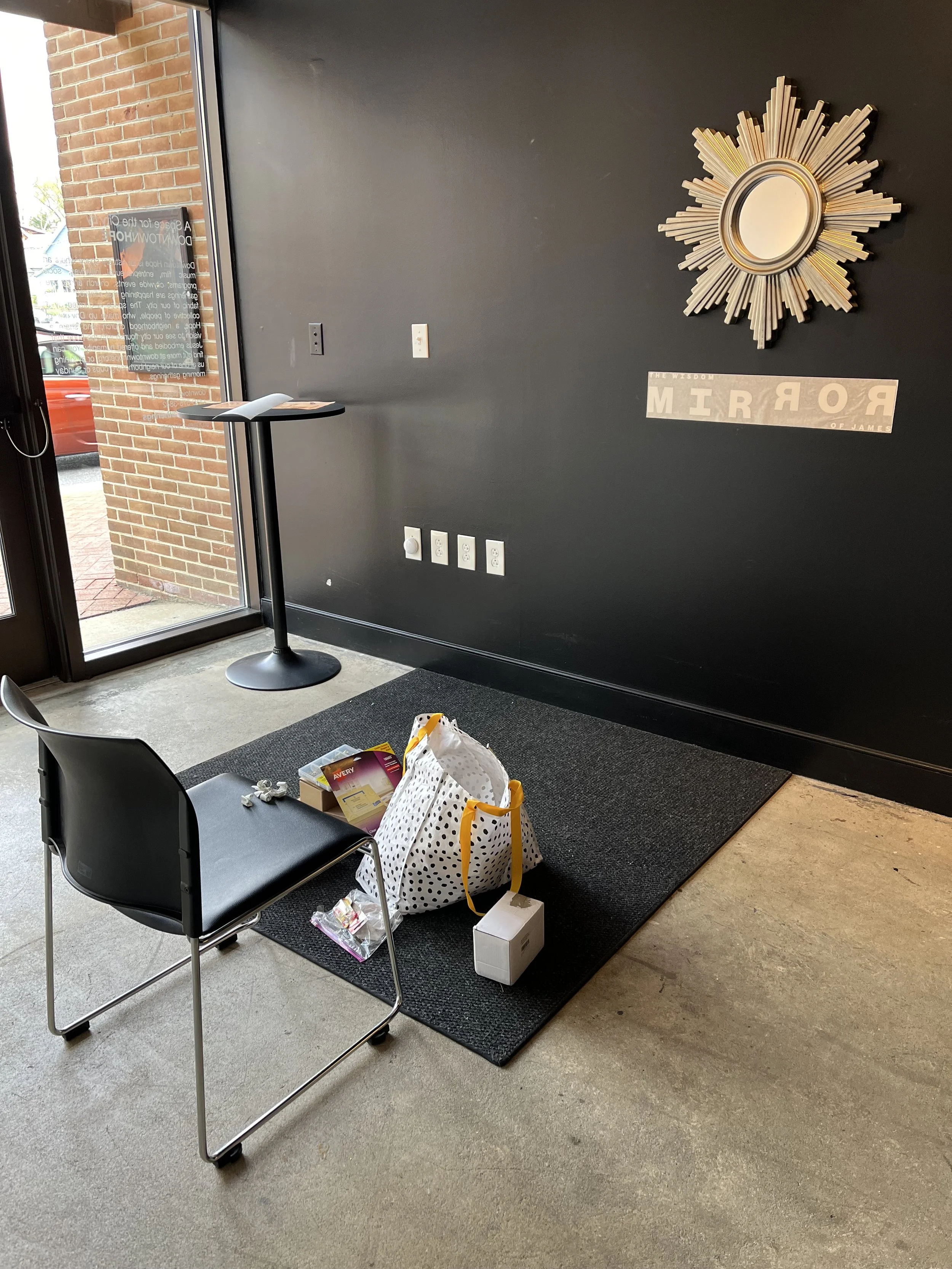
i found this mirror at a thrift store, it resembles the halo many times portrayed in medieval iconography. this mirror can add a sort of holy framing to the reflection of anyone who stands in front of it, a reminder of humans as god’s image bearers.

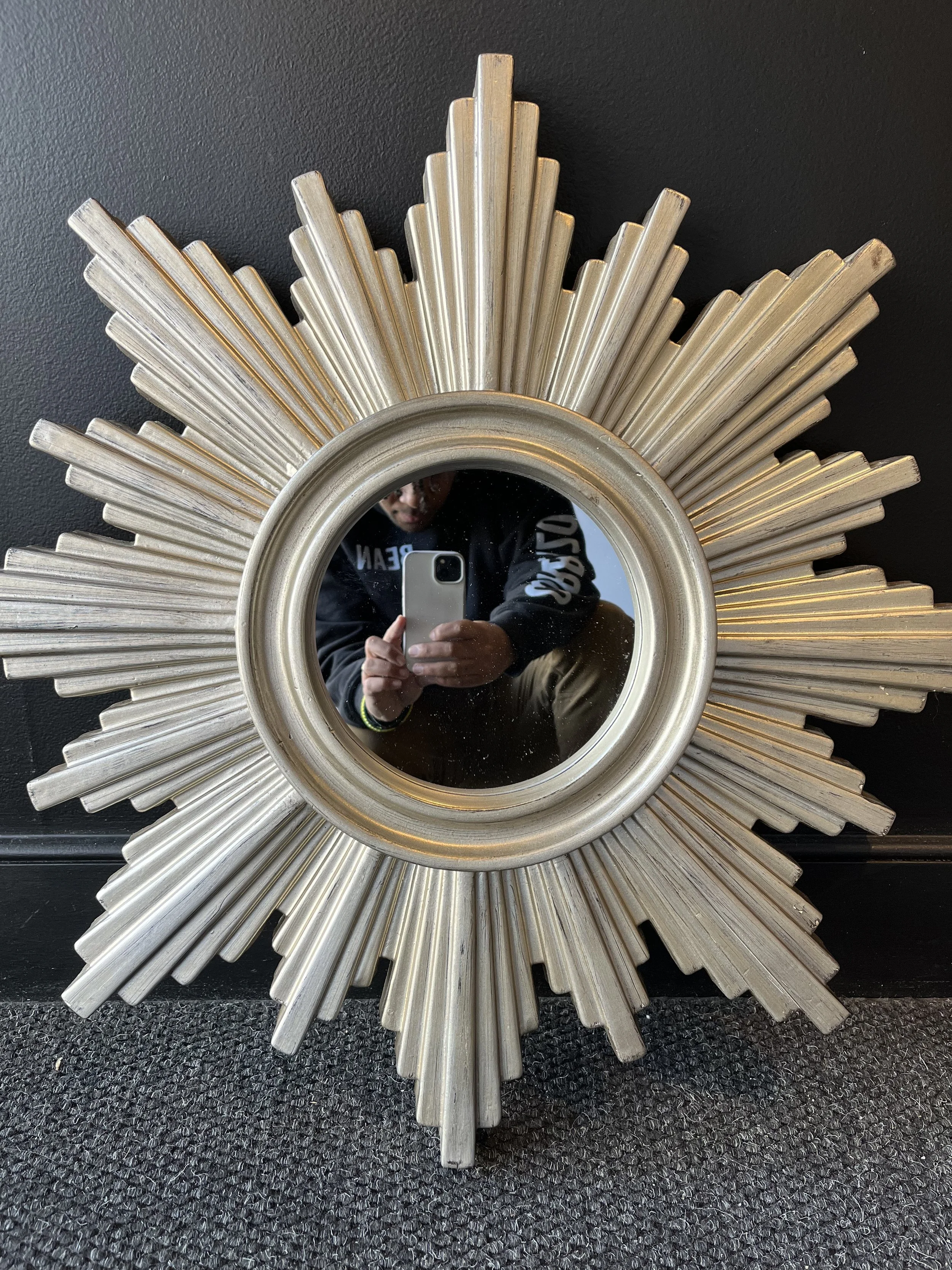
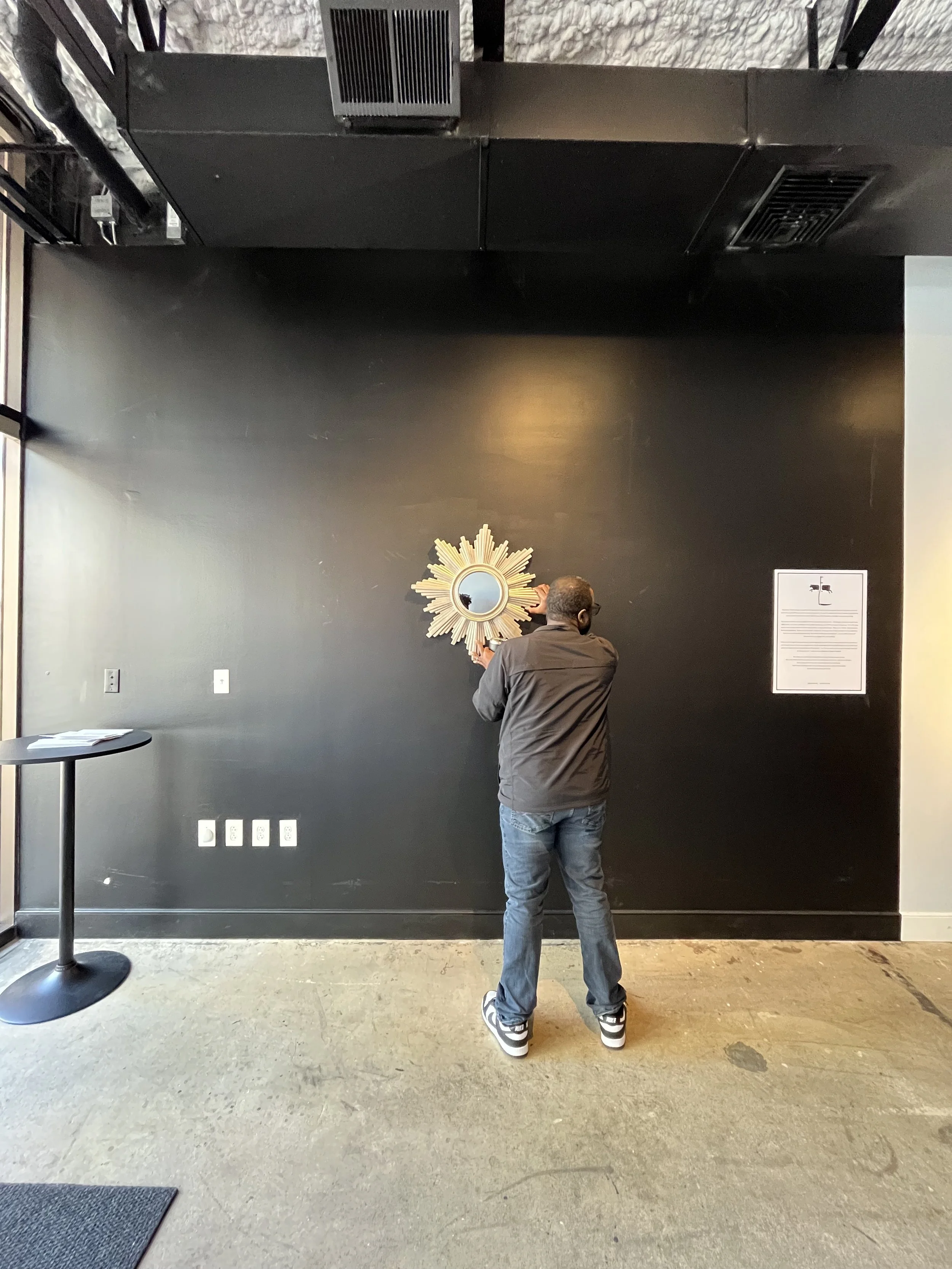
i enjoy everytime i can design for the real world beyond the screens, sometimes just the placing of a physical element in an intentional place can extend the visual story of the brand beyond its assumed limits. and so the shape of the mirror, the title, and the subtitle “the wisdom of james”, three simple elements to identify a short but deep sermon series


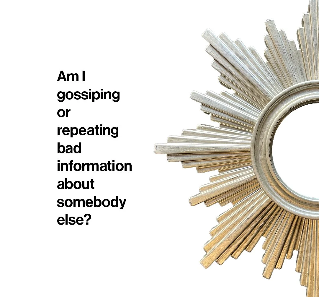
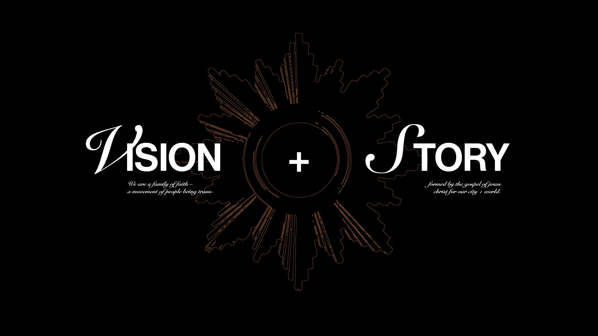
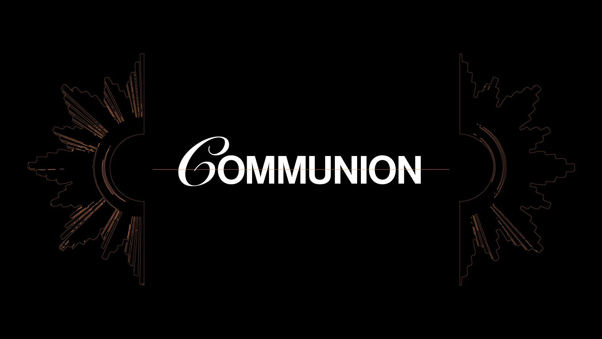
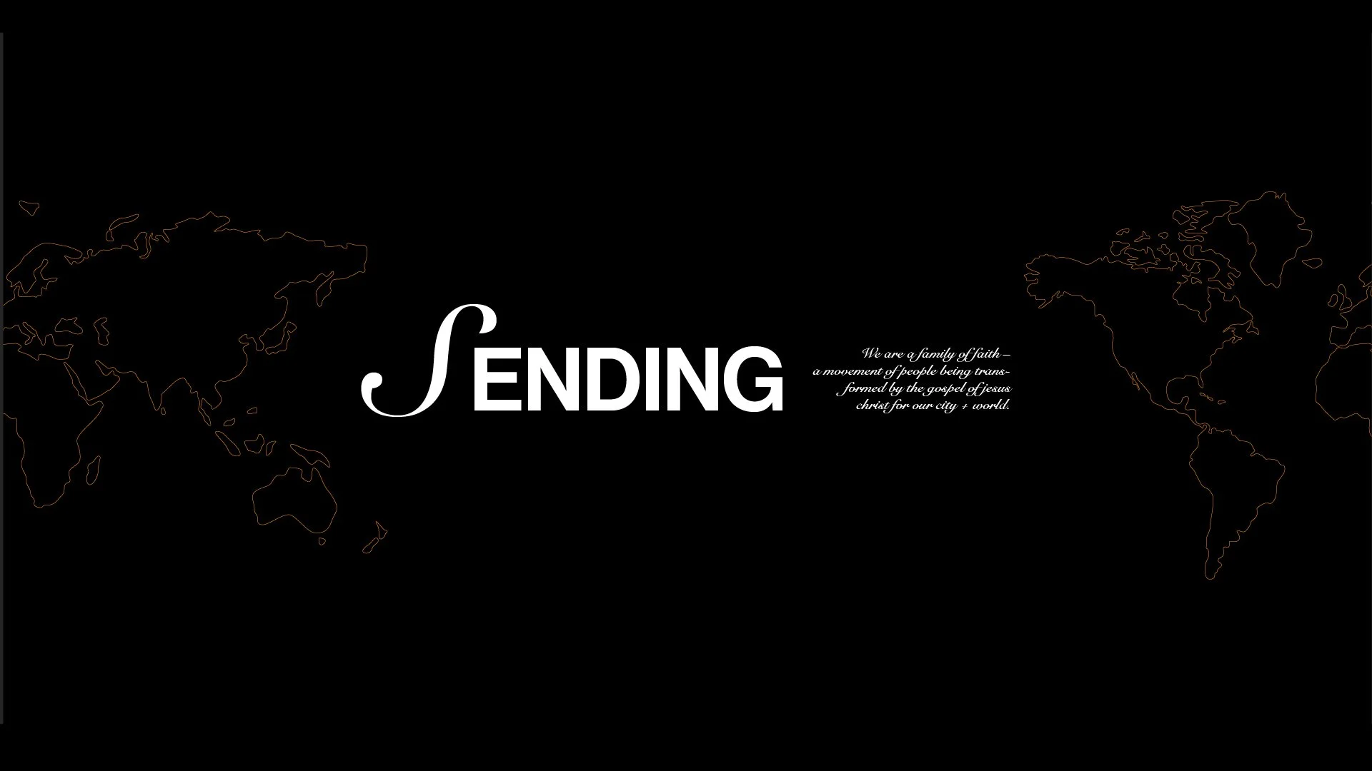
i decided to use the mirror as a visual motif for the series branding. here are some of the slides meant for different moments of the sunday gathering. i would rebrand them for every sermon series.

social media posts

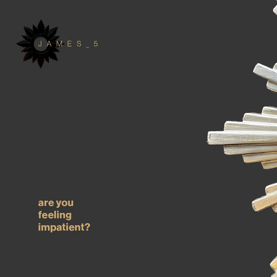
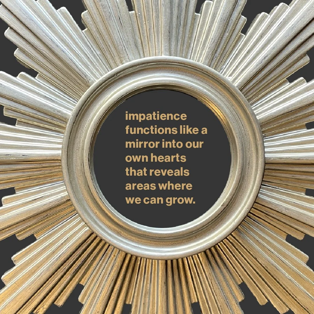
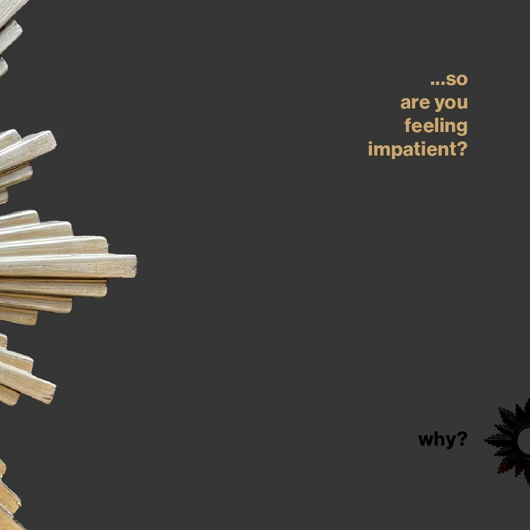
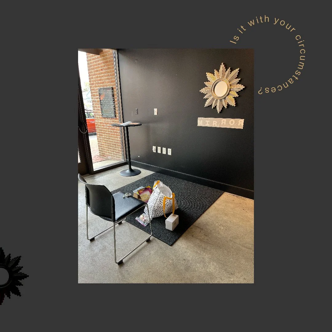
For this series I also created Instagram Carrousels to capture the essence of some of the key ideas shared on each sermon. These are two examples.