EDITORIAL DESIGN - GRAPHIC DESIGN
Art Exhibition Catalogue Design
CURITIBA BIENNIAL
In 2017, U.S. based Curator Royce Smith brought a broad, comprehensive curation of hispanic artists to the Curitiba Biennial in Brazil. Later on, I was contacted by him to create a catalog as a documentation of his exhibition. This catalog also was going to be bilingual. It would include a curatorial narrative that we decided to spread throughout the whole book and a brief artist statement along with art pieces images.
The result was close to 200 pages of art. Each artists, being so different from one another, allowed me to create a different layout for each page. And I say “allowed me” because I really enjoy designing every page differently, not fitting everything on the same box. That’s why I make zines, but that’s another story.
The concept for this project can be summarized in two words: Diversity and Complexity. Latin American culture and expressions tend to be put in the same bag; as if Mexicans, Argentinians, and Cubans, were the same because we are all hispanics. Art is a valuable way to show what’s unique and authentic to each country and life experience.
six big sections plus addendums. complexity and diversity as a concept led me to create a simple incremental code sequence for numeration.
six big sections plus addendums. complexity and diversity as a concept led me to create a color grading that travels in between numbers.
chapter or section beginnings using color, and sequence code


each artists would be presented with a color rectangle and a coded number according to the section they are in. in this case, the cuban artist nestor siré is in the section 3 of the book.
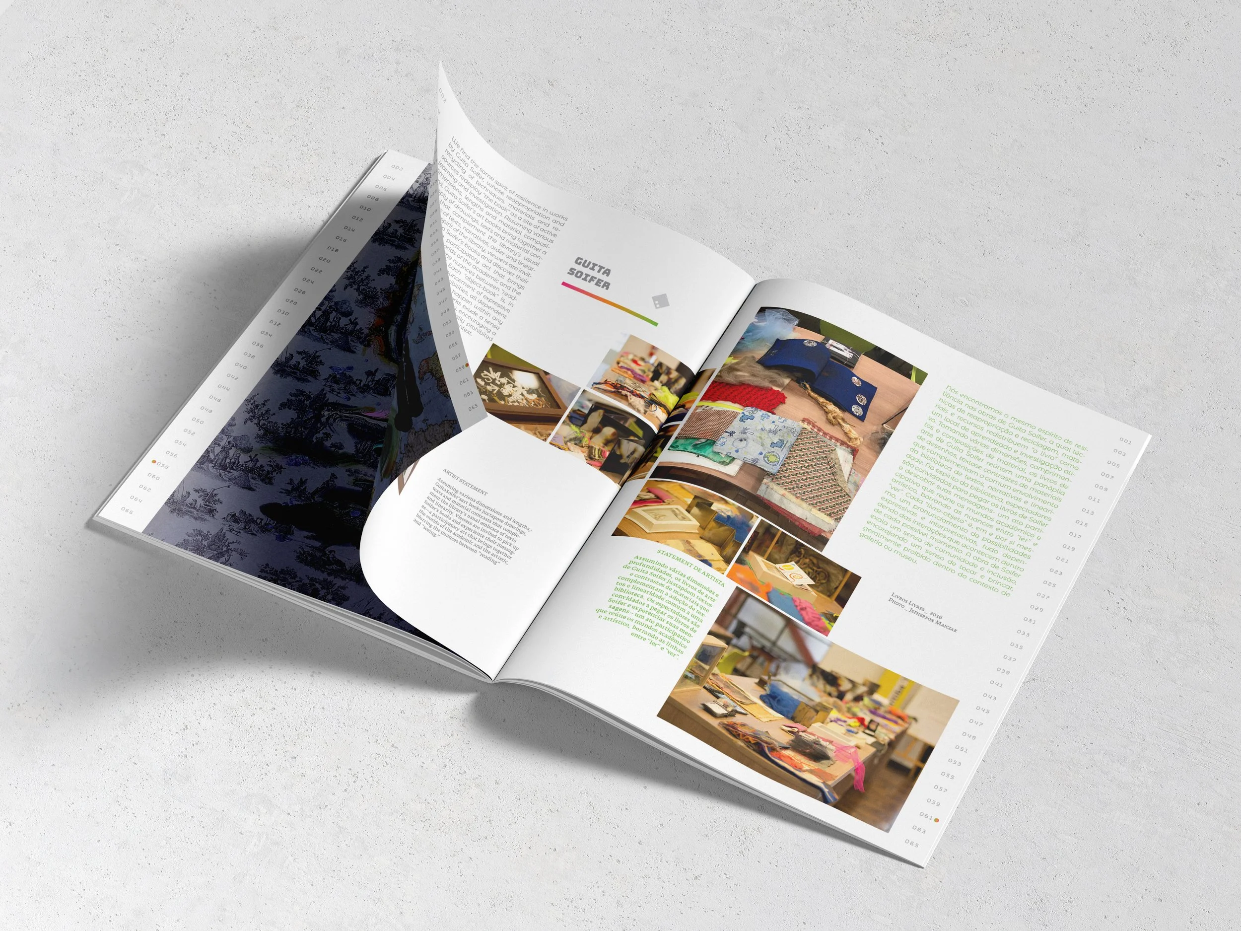
complexity led me to try a different pagination concept. a sort of a scroll through all the available numbers corresponding to pages. using the same color grading in a small circle signaling the imaginary scroll and marking what page the reader is on.
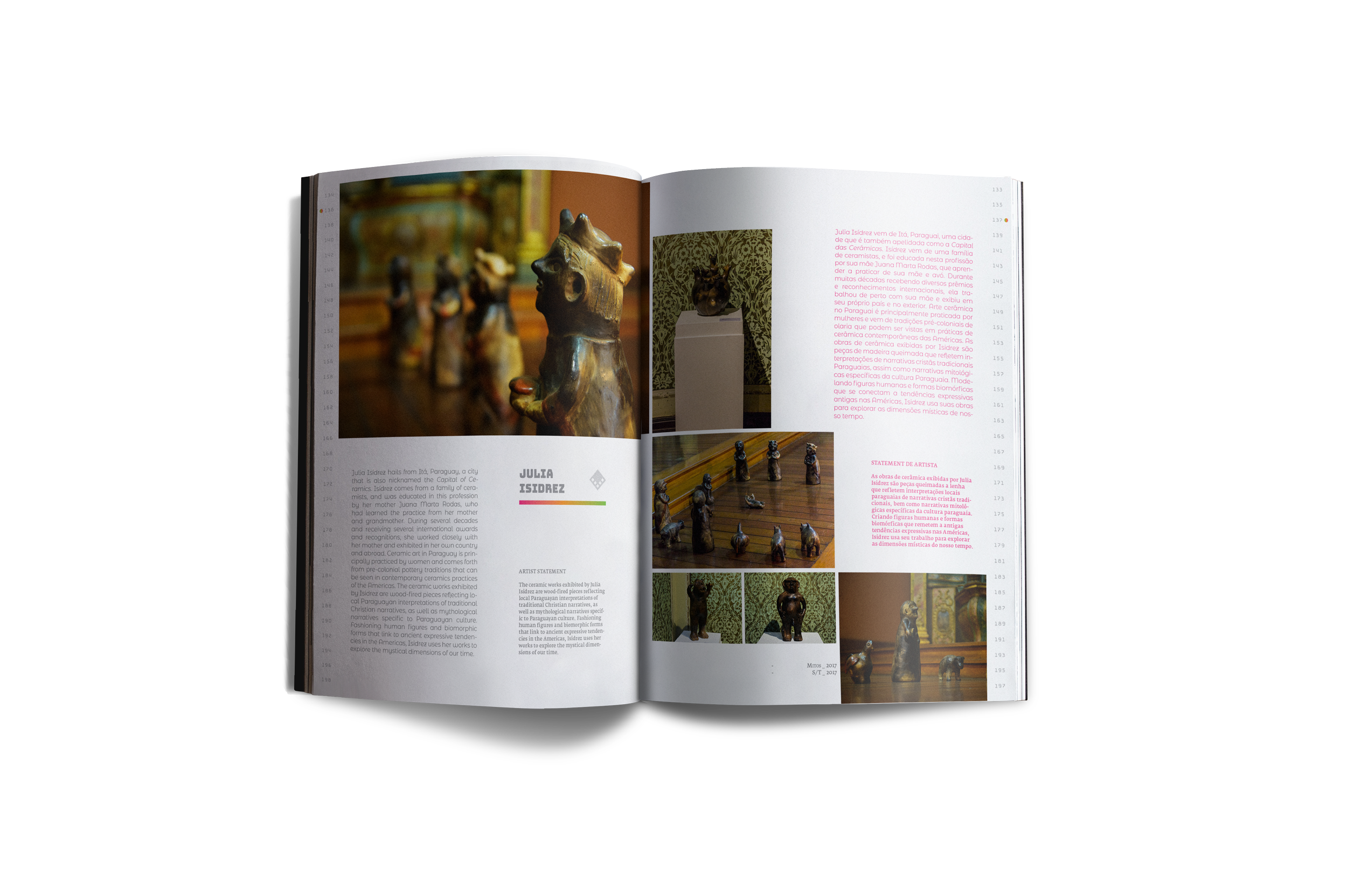
two different fonts to differentiate between curator narrative (left) and artist statement (right).
here some views of artist page layout. since it’s a bilingual catalog i used accent color for portuguese language to differentiate from english (gray). accent color would varies following the main color of the chapter we are in.


