

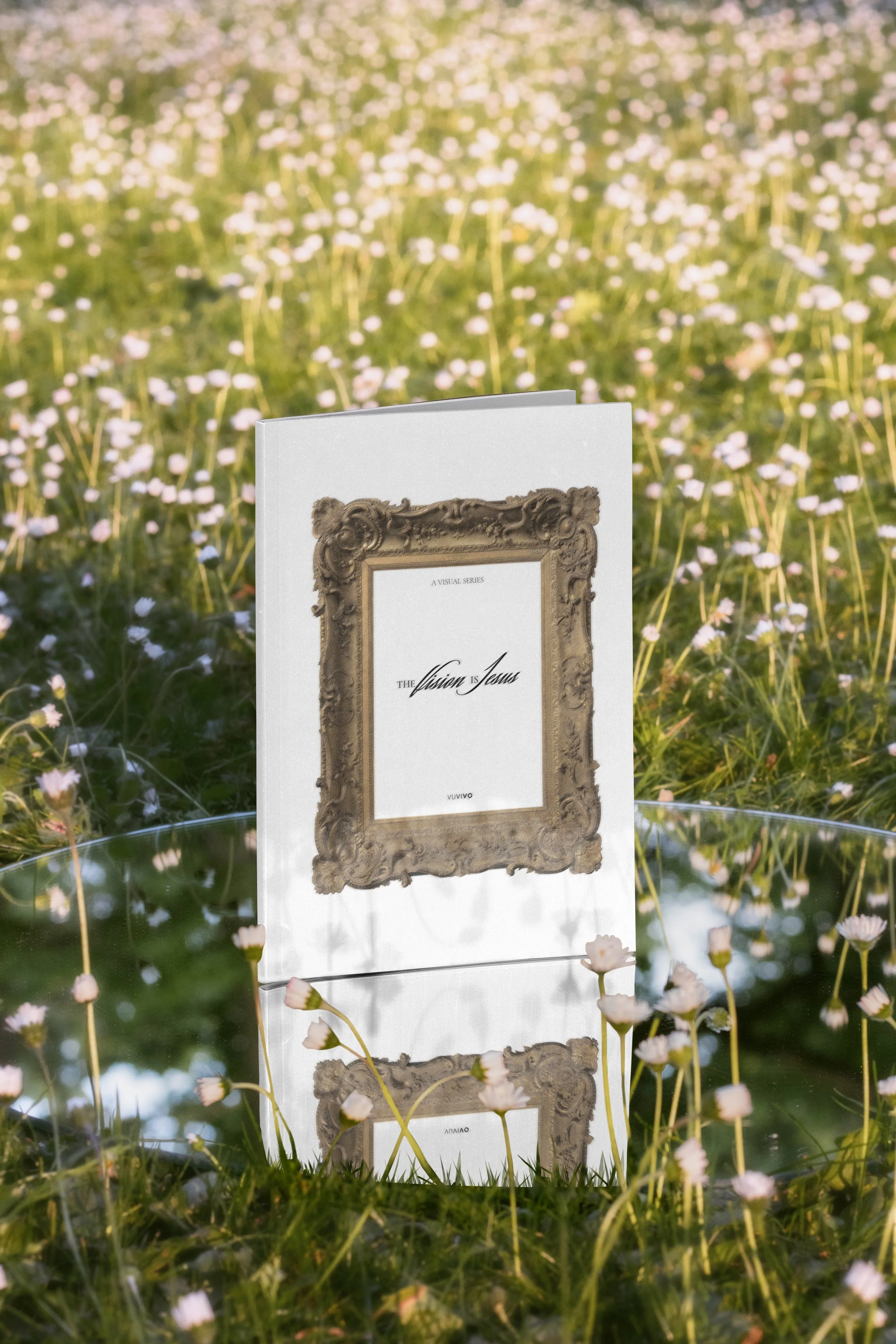
a booklet design for an art fundraiser
client: “the vision is jesus” series (by vuvivo)
EDITORIAL DESIGN - GRAPHIC DESIGN THE VISION IS JESUS is a series commissioned by VUVIVO. Seven modern painters create seven fine art works. The series is designed to function both individually and as a unified, immersive experience. It’s currently still in process, with half of the paintings still being created or commissioned (as of 2026).
Initially I was approached to design a booklet that would serve as support in their effort to raise funds for the series for fundraising events and conversations.
THE CHALLENGE. In reality I was trusted with a visual translation task. They needed me to bring the founders ideas to something readers could understand and embrace.
Six of the seven pieces depict historic encounters with Jesus. In the seventh piece, the encounter shifts: the viewer becomes the one who meets Jesus. The audience joins this historical procession of witnesses who have seen Him. “The Vision is Jesus” _Zach Elliott.
AUDIENCE: Potential donors, fundraiser events attendants.

brand strategy:
THE VISION IS JESUS needed a distinct visual identity. An exhibition-compatible brand that lives alongside the artwork. The series will have a cohesive identity (typography, symbols, possible monogram or mark) that evokes a sense of crossing a threshold. Modern to Classical, Art to Encounter.
Ultimately, this series does not rely on tradition as authority, but on tradition as invitation. It brings the modern viewer into the same moment of wonder faced by the first witnesses.
I developed the following symbols as a cohesive system that can live across posters, booklet, website, and gallery space.
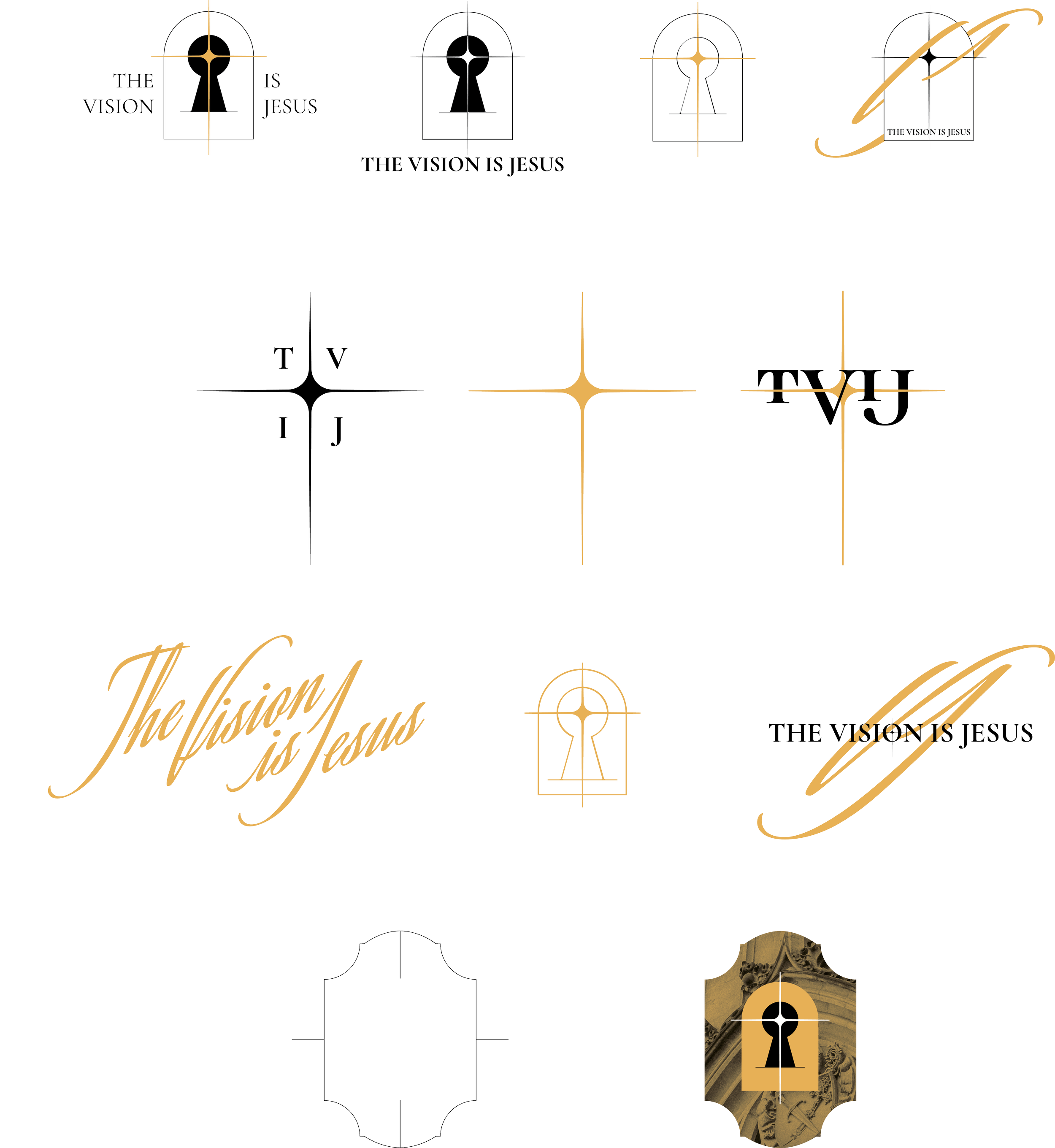
brand strategy, visual language:
The Aesthetic Vision of THE VISION IS JESUS is rooted in the conviction that beauty is not ornamental, but revelatory.
Branding then draws from the depth and integrity of the classical tradition while speaking to a contemporary world, seeking revelation through form. My goal was to treat Beauty as a vehicle of truth, not just an expression of my taste.
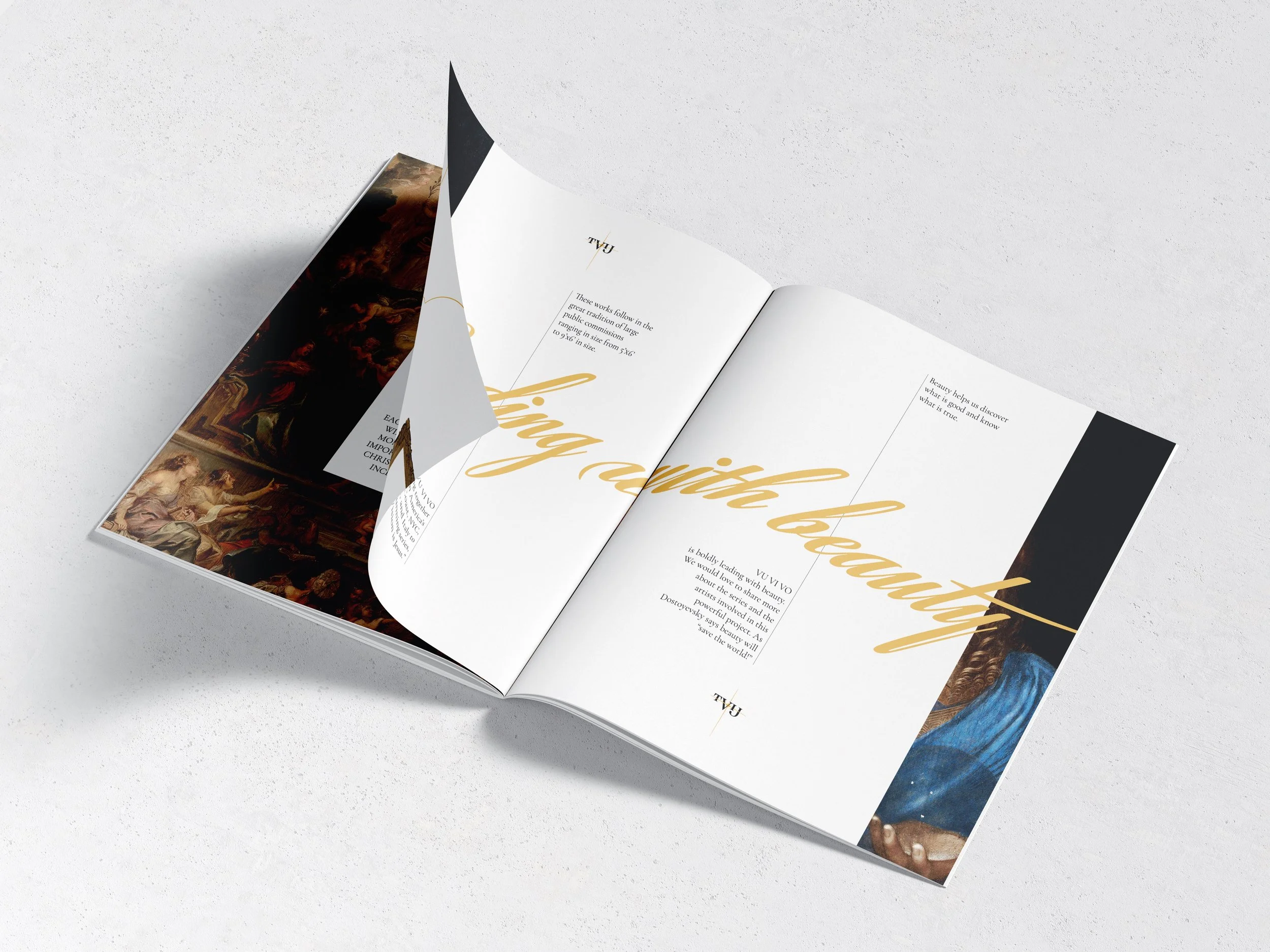
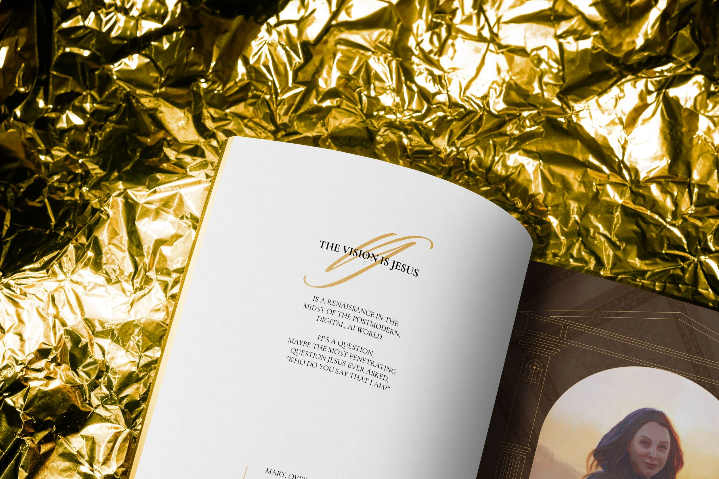
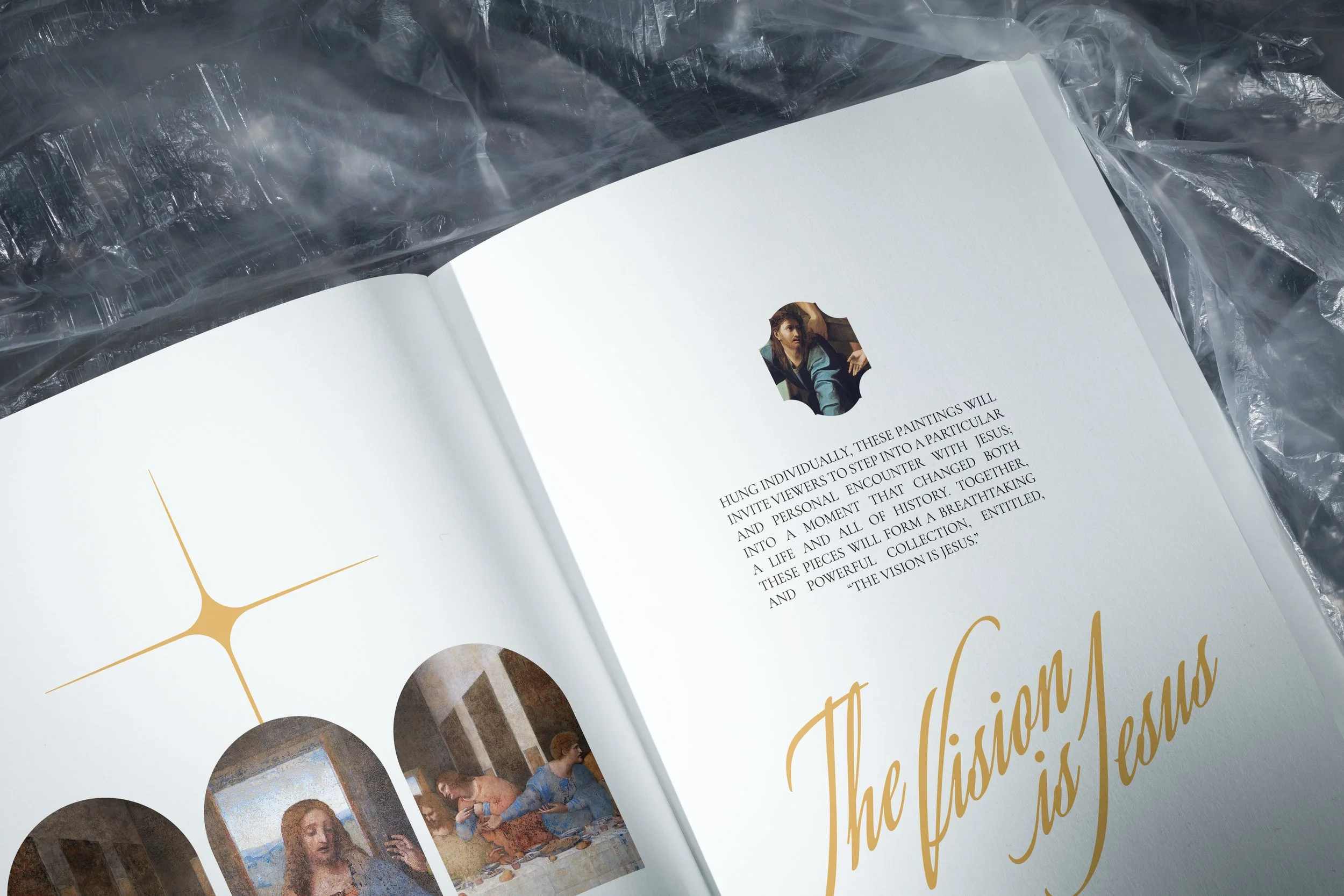
Typography (serif as classic and timeless and handwriting as if Beauty was adding its signature. Light, Spark and Cross blend and share the same symbols. Color aims to honor the craft and tradition of great painters.
All these visual elements would define the book’s look and feel but also pave the way for a future consolidation of a branding package for the series as a whole.
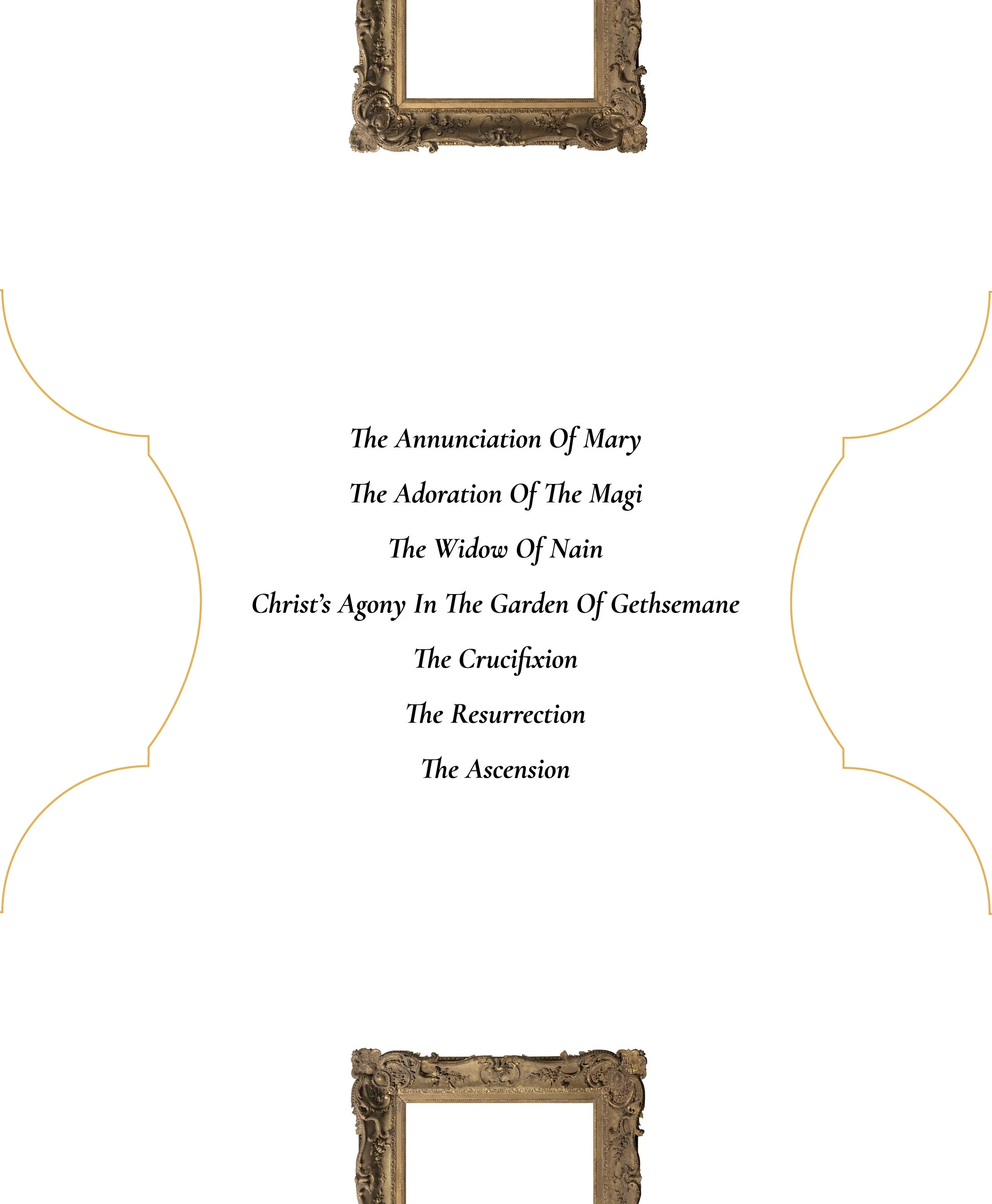
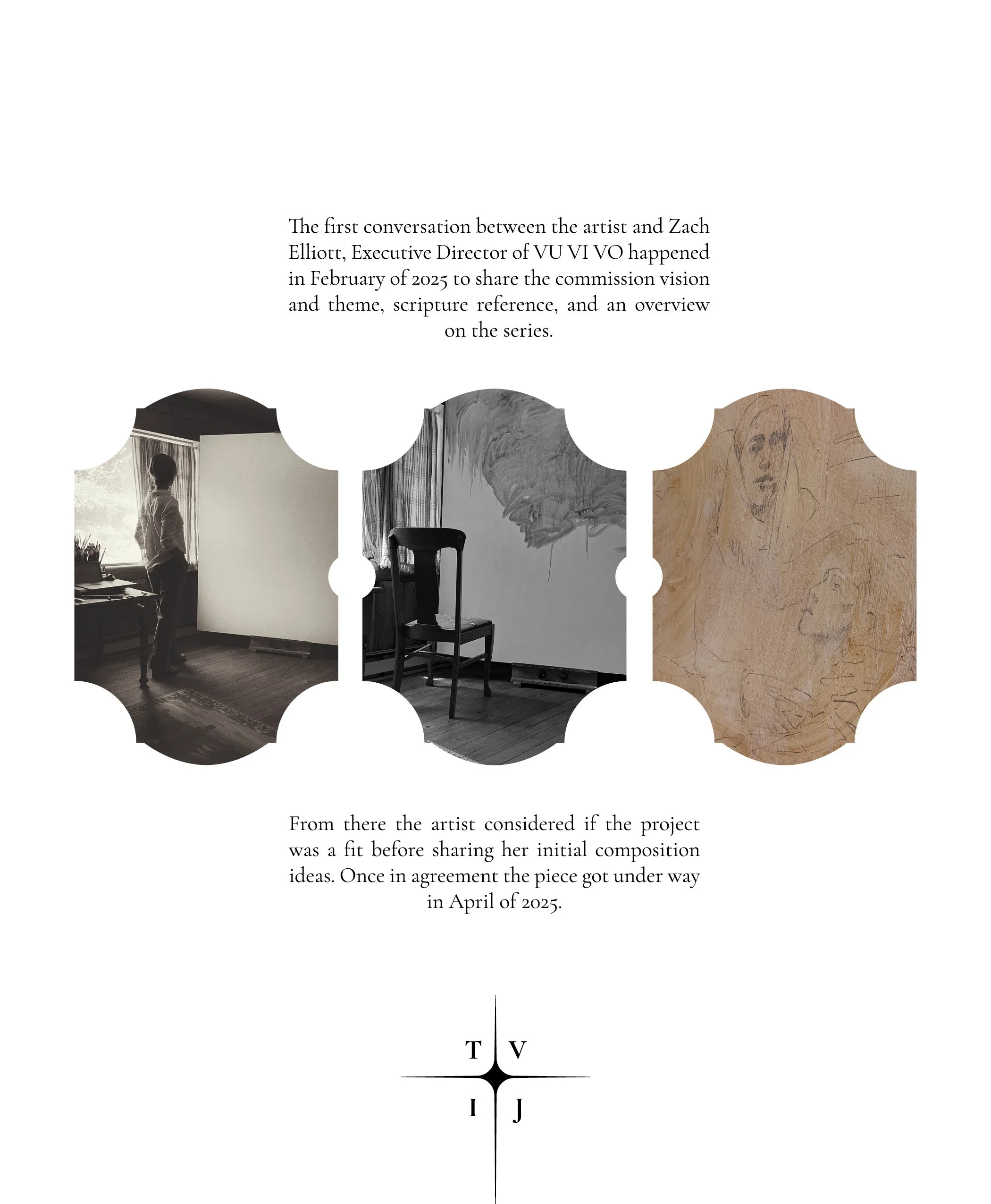
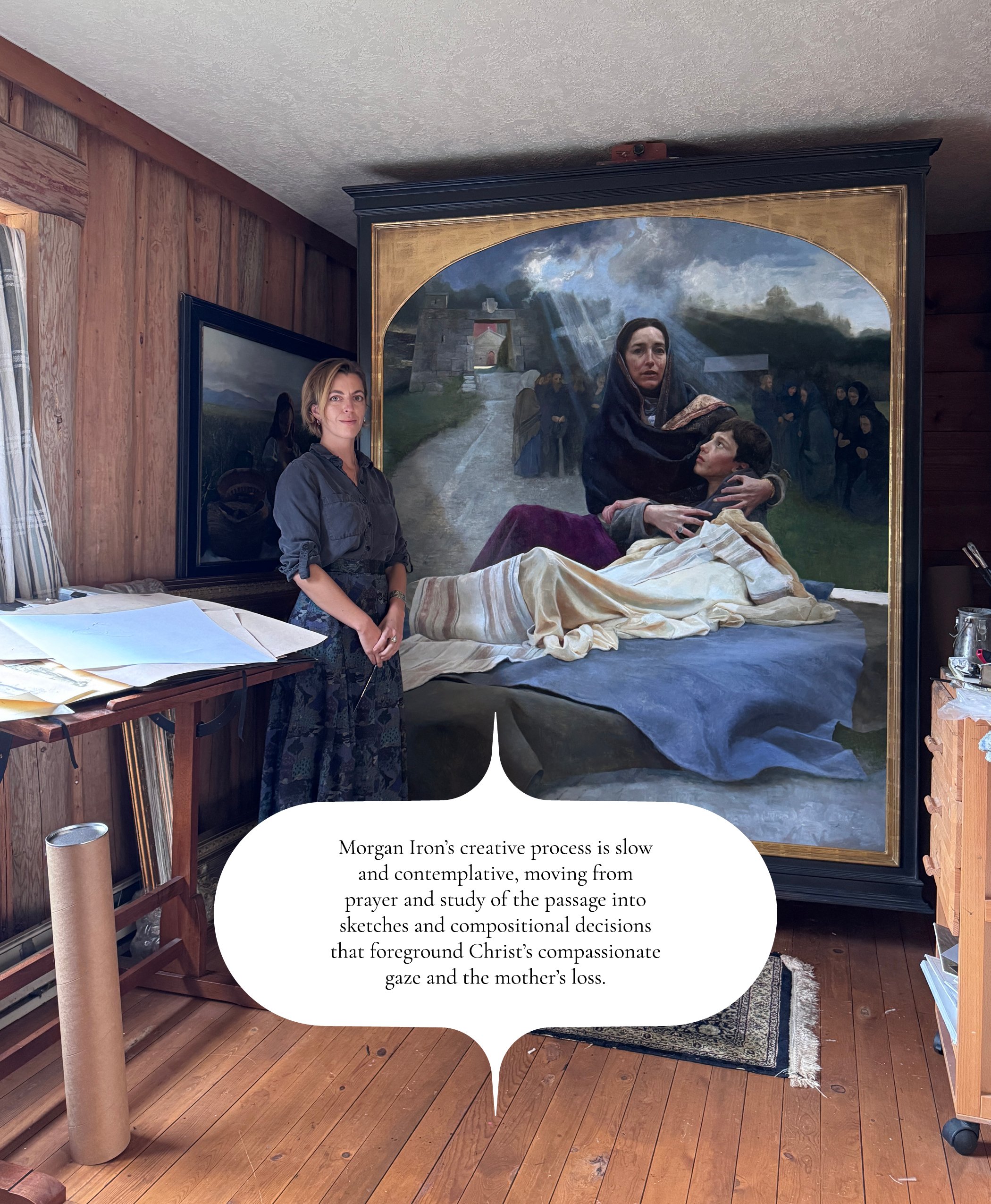

how to SEQUENCe for a case for support:
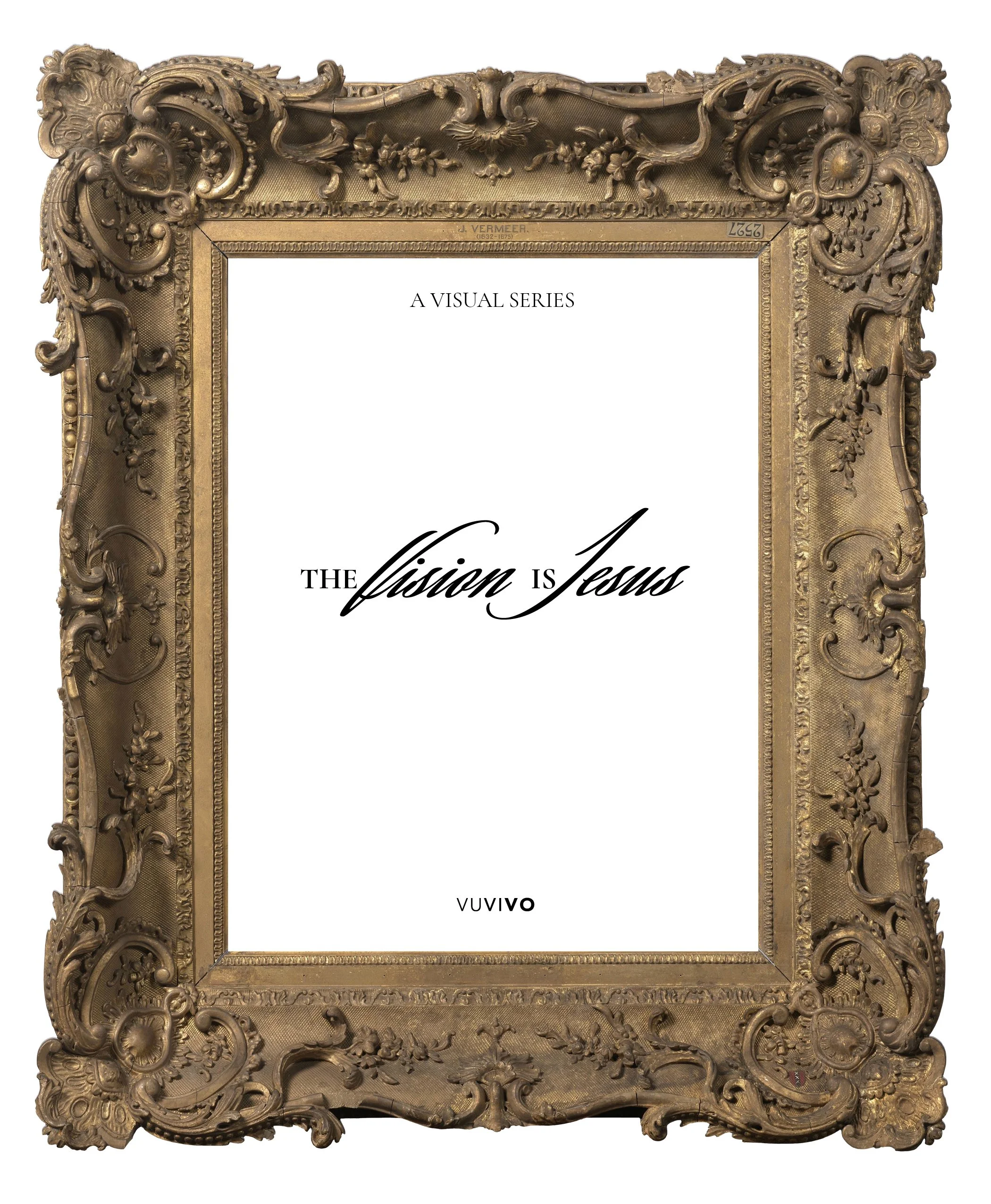
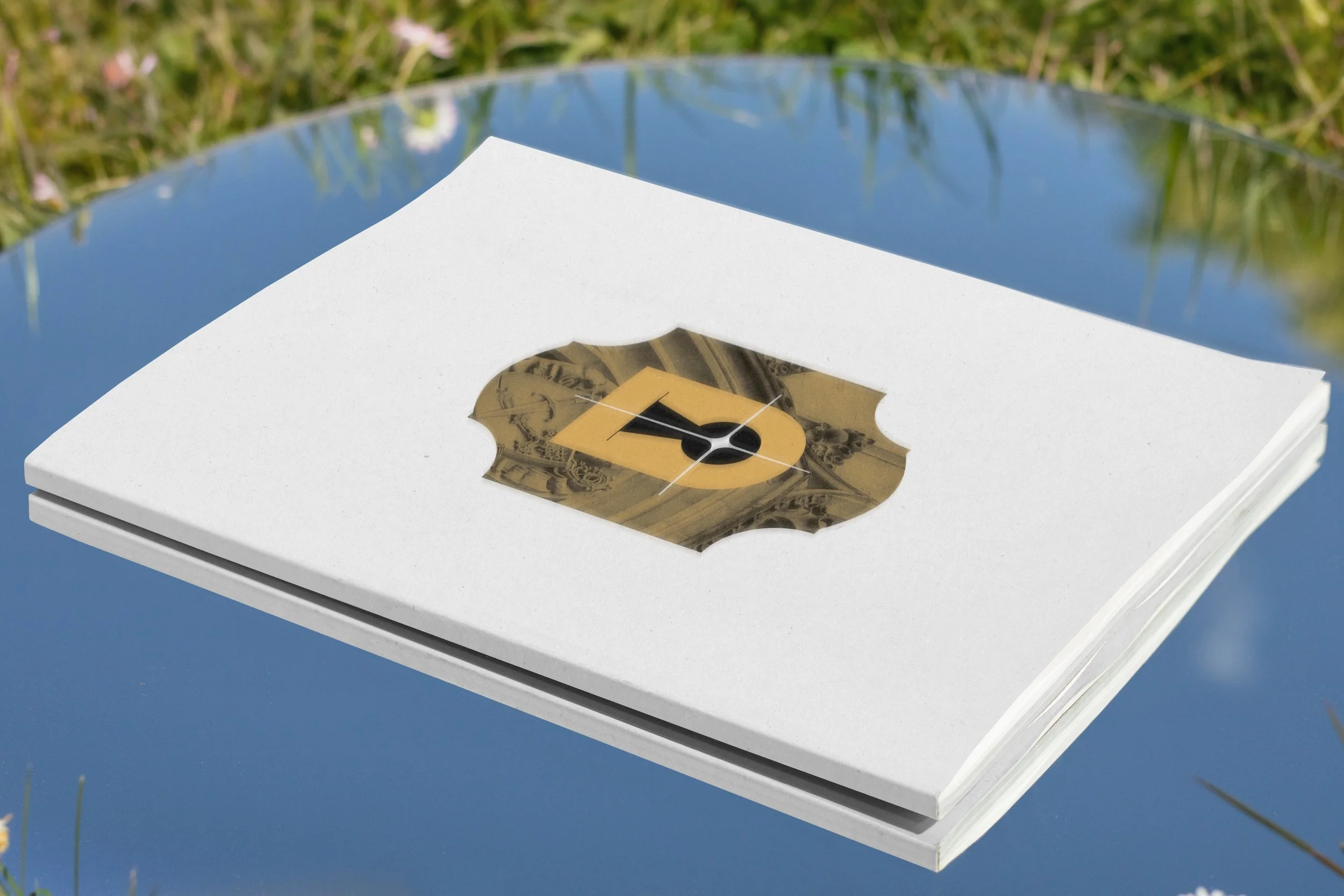
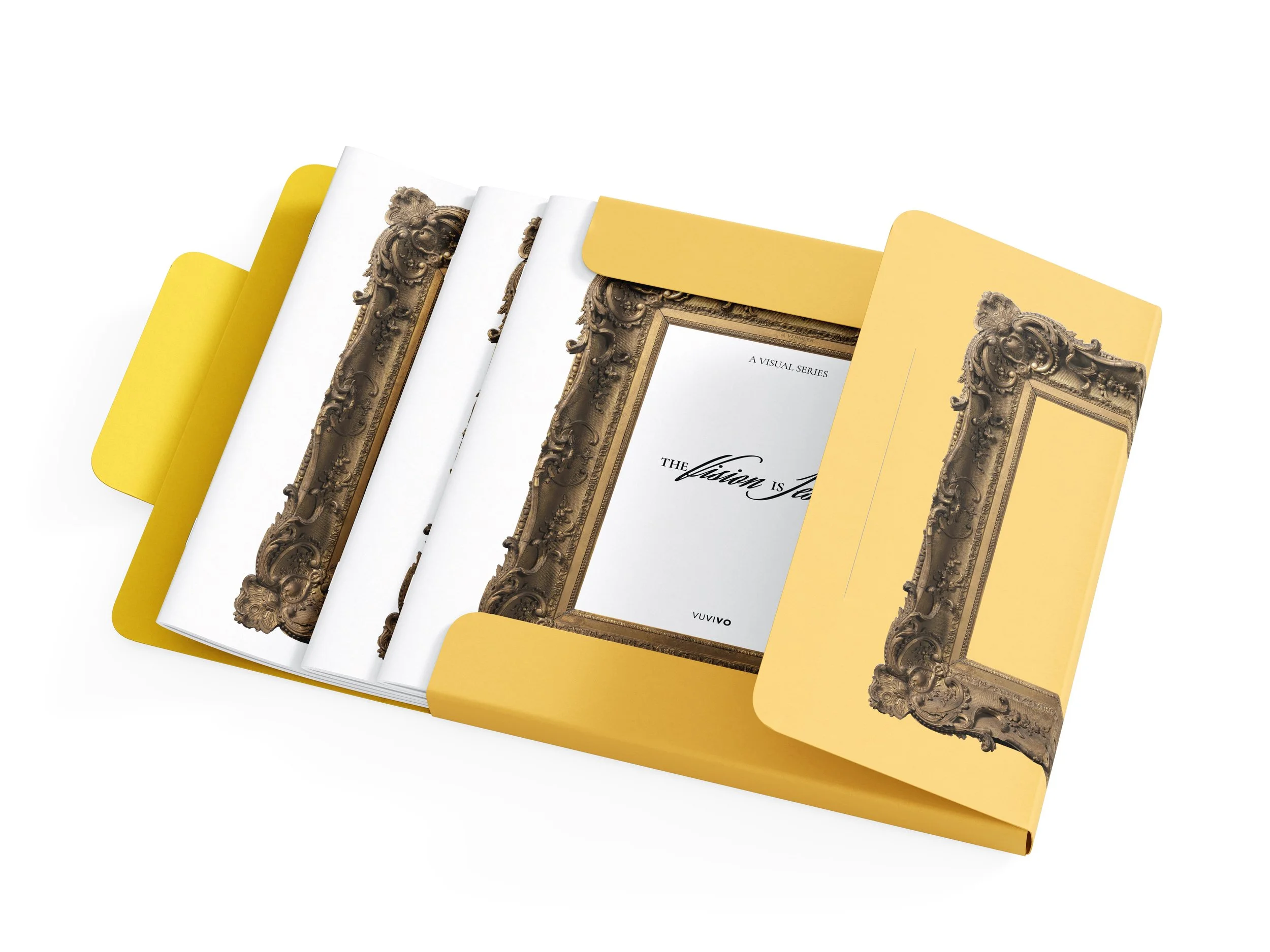
COVER: The empty frame instead of featuring any particular piece. First, because in this case all the pieces weren’t finished yet and documenting those that were was second to communicating the concept. Both the book and the series point to something else: “The Vision Is Jesus”. Visually intriguing by being minimal and concrete.
ARGUMENT: The Case for Support. It inserts the potential donor with a tradition of Christian patrons of the art who enabled, in Zach Elliott’s words “the world greatest artists to share the greatest story ever told”.
ABOUT US: Why to support this organization. VUVIVO is committed with this patronage tradition but also with its extension to a new generation for the sake of our current time but also for the ones to come.
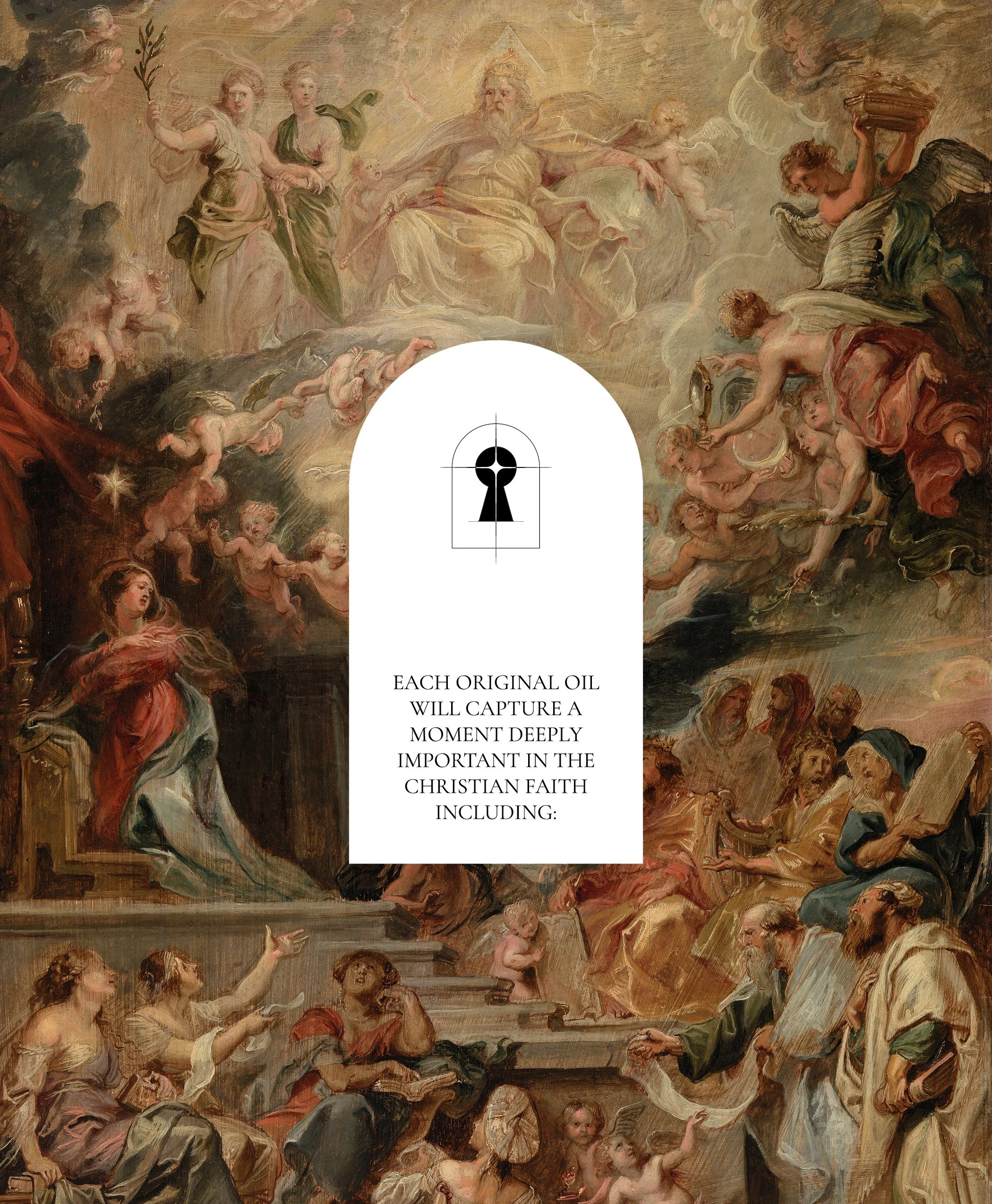
DESCRIPTION: A brief definition of what the series is about, its structure and implementation and the effect we hope it to cause on the viewers.
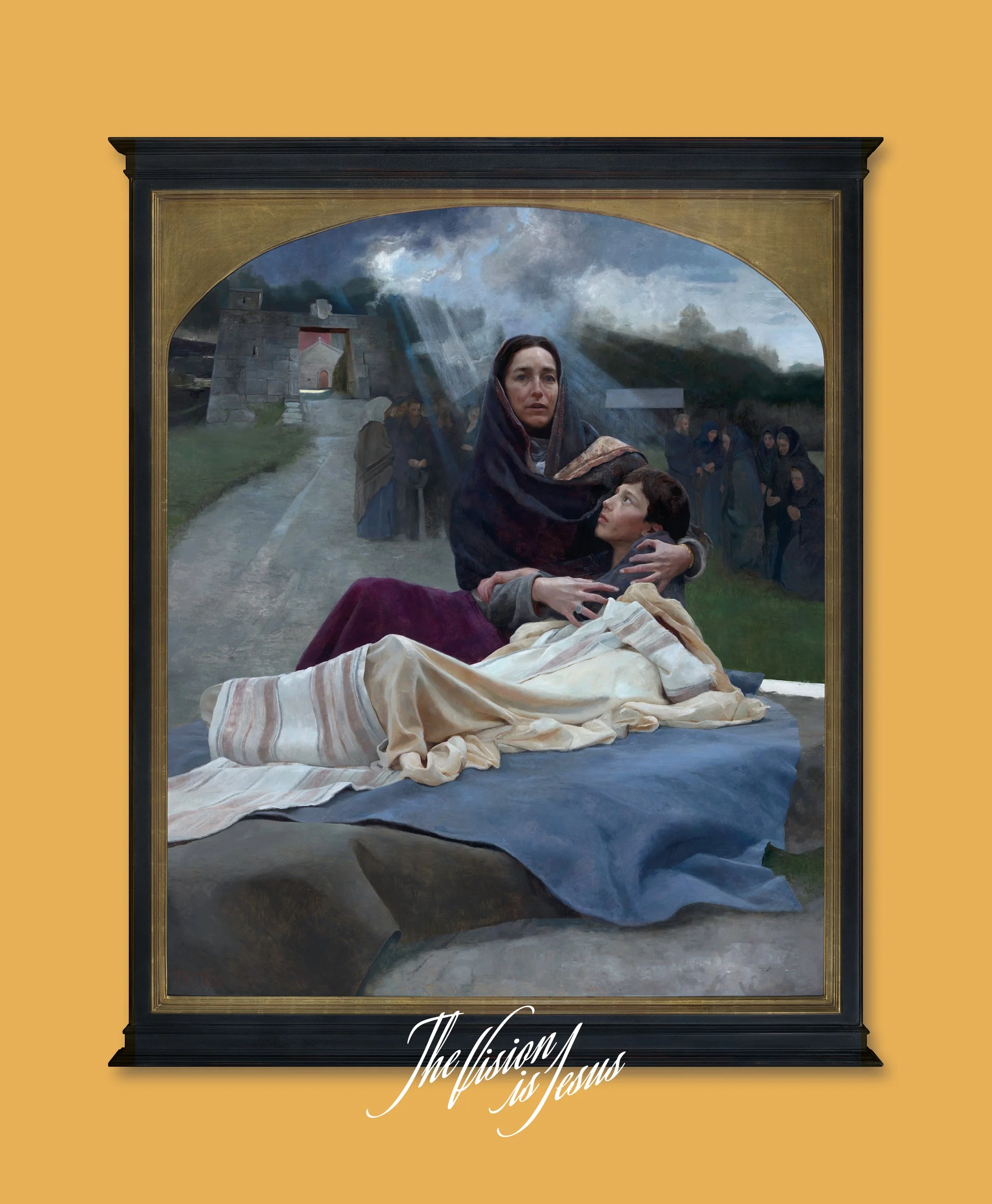
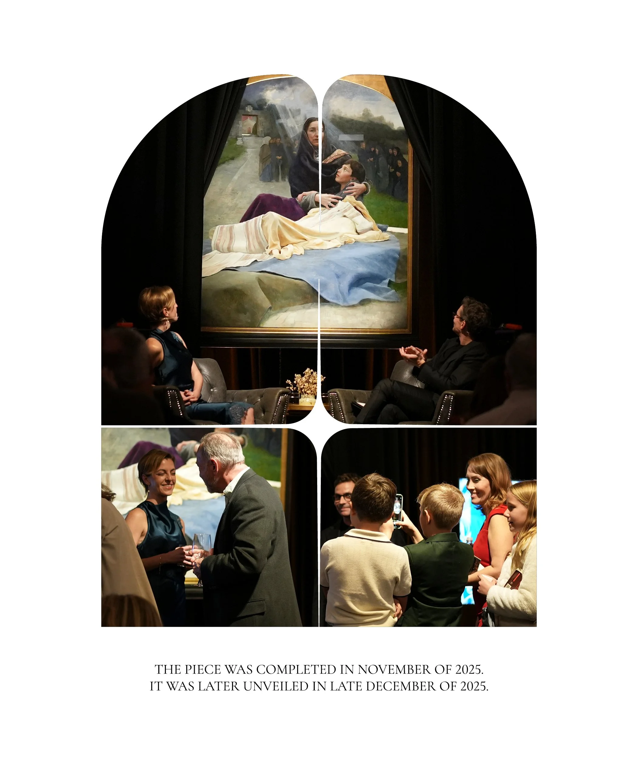
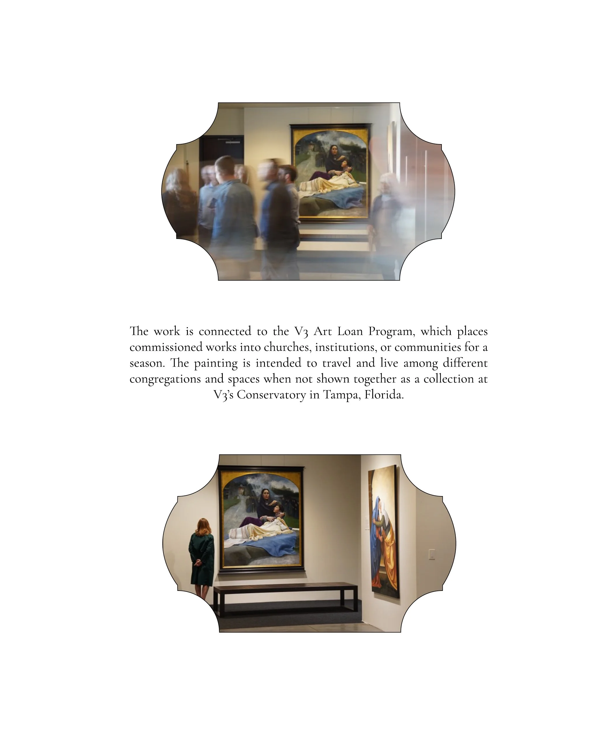
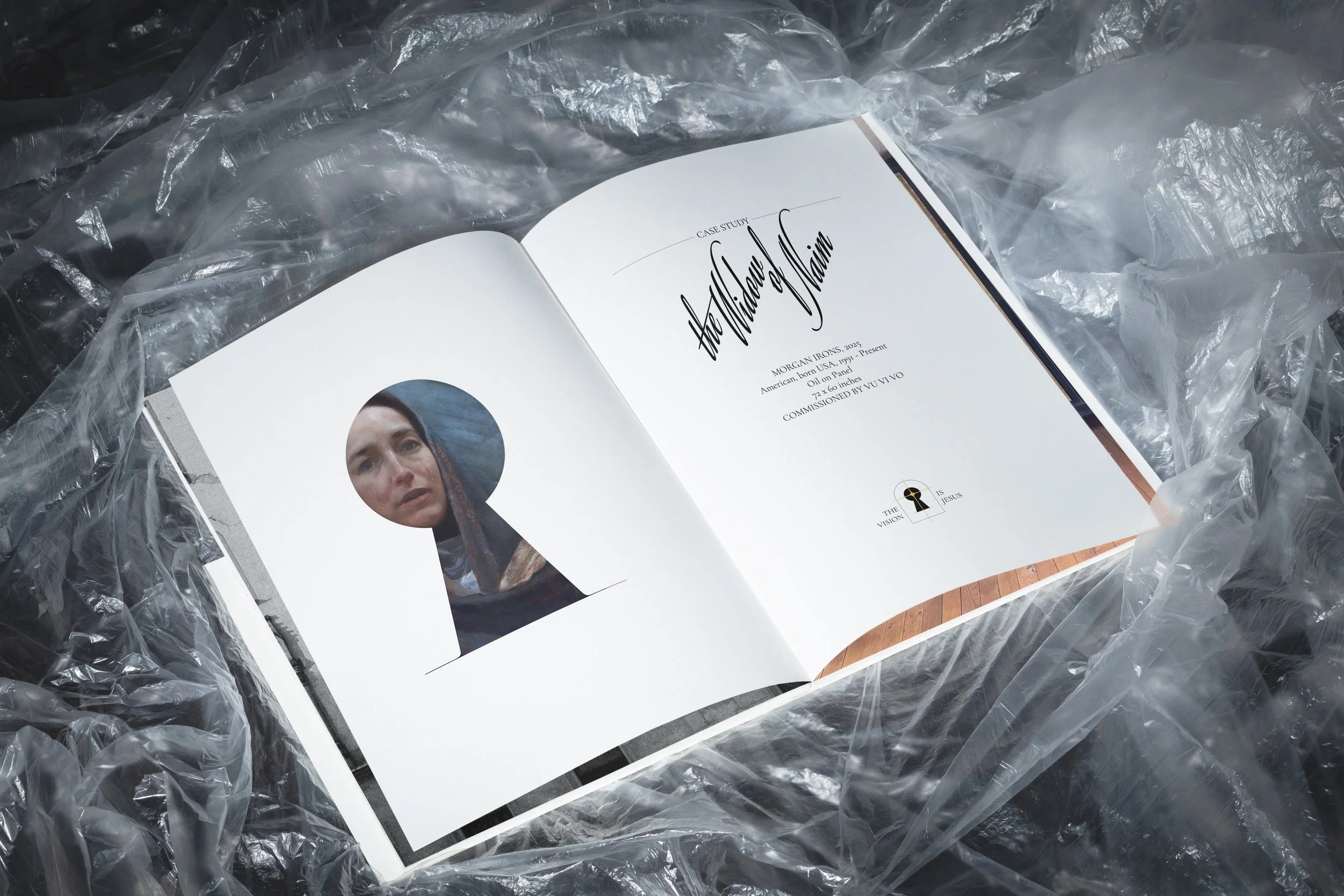
A CASE STUDY: Briefly tell the story of one of the pieces already completed. In this case, “The Widow of Nain” by Morgan Irons being followed from commissioning, creative project, final result, unveiling and public display.
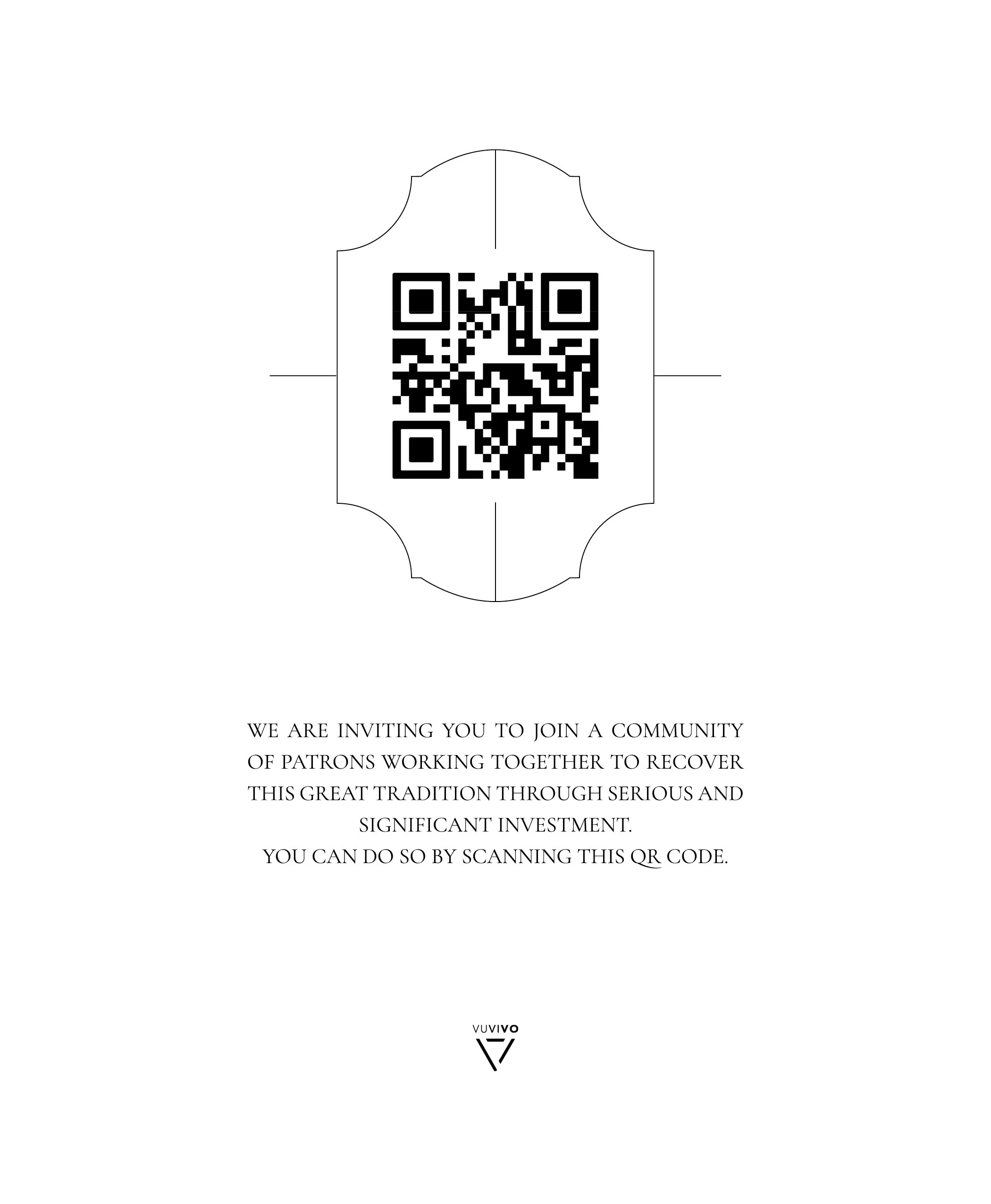
“CALL TO ACTION”: Invitation to join a community of patrons by scanning a QR code.
Results:
translating vision into form for others to see
Reduced Cognitive Friction by defining and implementing a Strategic Communication Architecture. Structured the information / Clarified language / Anticipating questions / Organized narrative logic Turning: “What is this?” into “Oh. I understand this.”
Elevated Perceived Legitimacy by leading with good and adequate design. Legitimacy is already there, nothing needed to be exaggerated.
My role here was as “Translator of Vision”. Extracting meaning / Structuring it / Giving it language and visual gravity / Making it coherent and beautiful.
the booklet is now a fundraising asset
A donor conversation tool. A credibility amplifier. A bridge between vision and capital
the booklet has been used at:
At a dinner with potential supporters.
At a breakfast with a long-time donor.
In board conversations about future fundraising.

CAse for support: classical painting series

CREATIVE DIRECTION - STRATEGY - EDITORIAL DESIGN - GRAPHIC DESIGN